Sunny Balasubramanian
Current quantitative researcher in the crypto & equities space. Formerly at Citadel, AQR, Columbia SEAS '16. Always cracking away at new (sometimes whimsical) problems using different kinds of technology. Please reach out to me at sunny.m.bala@gmail.com if you'd like to chat about any of my prior work or would like to hack on something together. LinkedIn | GitHub
Numerically Reducing Elevator Awkwardness
by
Elevators are awkward. Our office recently recently had some work done on the stairs and required everyone to take elevators for several weeks. This led to some congestion and tightly packed spaces – it was a great way to feel close to co-workers! There wasn’t anything unusual about this. At every floor, a few people people would get out. The remaining people would shift around a bit to use up the new, free space. This got me thinking. How do people determine where to stand? What are the optimal standing locations to minimize awkwardness?
The Plan
Simulate groups of n people in an elevator. Find some quantitative way to measure elevator awkwardness and determine the arrangements that minimize it.
Approach
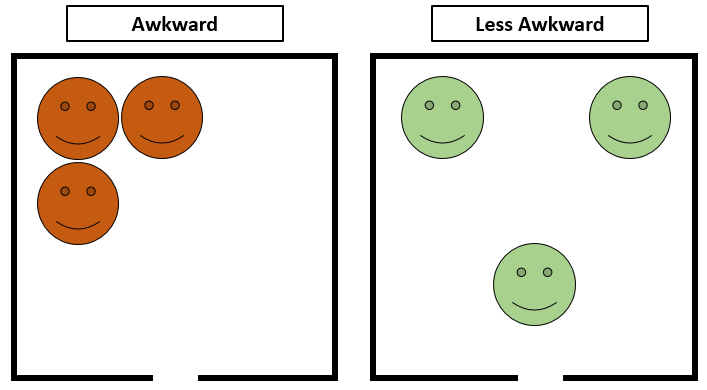
What makes an elevator uncomfortable? One natural idea is how close people are to each other. For example, the situation on the left seems far more awkward than the one on the right.
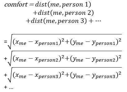
Based on this, we might want to try just using the distance formula as our proxy for awkwardness. For example, my discomfort in the elevator could be a function of my distance to each person in the elevator, like:
This sort of makes sense. Under this scenario, this simulation could work like the pseudocode below.
- For every person in the elevator
- Calculate the comfort formula. Record it.
- Figure out a direction to for the person to step in.
- Move the person to the new spot.
- Repeat this for every person in order over and over again
The hope is that after many many times of each person choosing a direction and stepping in it, they’ll arrive at stable situations.
A Step in the Right Direction
Choosing this drection was a bit tricky. There’s lots of different options. The quantitative way might suggest just taking the derivative of the comfort formula from earlier with respect to x and y. This will tell us about how many units of change we can expect in the comfort level for a 1 unit step in the x or y direction. Not a bad idea, though the derivative isn’t the prettiest thing in the world.
However, maybe this isn’t so realistic. Consider the example below. If you were the blue circle and could only step left or right, which way would you step?
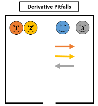
If everyone is in a line, the derivative ends up being really simple. For every 1 unit you move away from a person, you’ll earn 1 unit of comfort. In this example, if you move right, you’ll get 1 unit from person 1, 1 unit from person 2, and lose 1 unit because you’re getting closer to person 3. On the other hand, if you move left, you’ll lose 1 unit each from person 1 and person 2 and gain one unit because of person 3. You can imagine that each person is basically pushing you in some direction from different sides and that you’ll move in whichever way more people are pushing.
The derivative approach would tell you to step right, though most people might look at this and decide left makes more sense. This tells us there’s something missing from this formula approach. In reality, maybe you don’t care about getting an extra 2 inches away from several people on the other side of the elevator. Instead, you might really care about getting an extra 2 inches away from someone who you’re extremely close to.
In that case, we might be able to do this in an even simpler way. If all you care about is where you are relative to the nearest person, we can use a simpler rule for determining the direction to step in. Simply identify the nearest person, and take a small step in the exact opposite direction! We’ll still do the procedure for person by person and repeat many times to converge to a stable arrangement.
Code
The code for this project is available on GitHub.
I hadn’t made animations before but after playing around with tutorials about matplotlib, I eventually got up and running. The good news is that I didn’t need anything fancy – just a box to represent the elevator and a bunch of moving circles inside to represent people.
The general structure of the code looks like this in pseudocode.
def simulate(n_people = 10):
	# number of people in elevator
	# set up graphics (scatterplot with big circles) and boundaries
	# Create people data
	people = pd.DataFrame()

	# Initialize the people in random positions in a 1x1 square
	people['position'] = np.random.uniform(-.9,.9,(n_people, 2))

	def getStep(person_i):
		# identify nearest person to person_i
		step = -(nearest_person_location - person_i_location)
		return step

	def update(frame_number):
		# this gets called every frame of the animation automatically

		# for every person figure out steps
	    for idx in range(n_people):
			# figure out the step
		    steps[idx] = getStep(idx,METHOD)

		# for every person update positions
	    for idx in range(n_people):
		    people['position'][idx] += steps[idx]

	# Construct the animation, using the update function as the animation
	# director.
	animation = FuncAnimation(fig, update, interval=10)
	plt.show()
On the surface this looks not so bad, especially if you gloss over the details on how exactly to make matplotlib draw things the way you want to. In the real code I make a few modifications.
Firstly, I add a parameter to try different ways to each person’s next step. That way I could try a few different kinds of functions – for example, stepping in random directions instead of away from people.
Secondly, there’s a lot of things that can go wrong. One example happens when multiple circles are in a perfect line, like the example of when the derivative method fails. Stepping away from your neighbor is great, but if you’re in a perfect horizontal line with them you might actually be better of taking one step down or up rather than left or right. To avoid edge cases like this, when adjusting positions I actually add in a small amount of random noise to both the x and y coordinates when making the step. This can help make sure we don’t have situations like I mentioned earlier.
The hope is that after some time of simulation these things converge. Just to make the animations look cleaner, I slowly reduce the step size over time so that after a long enough time period the circles have hopefully settled and won’t need to take steps.
Results
At first glance, it looks like the simulation works! Here’s a video of the simulation at work for 3,5,8 and 9 and 20 people.
Starting places are random and matter when looking at results. For example, check out these two scenarios for 5 people. Just because the simulation ends at something stable, it doesn’t mean we’ve found something optimal.
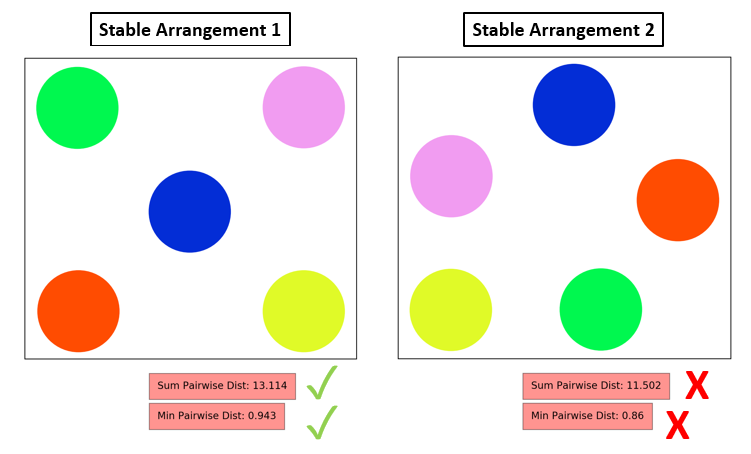
The two ending arrangements both seem kind of reasonable. If we compute the sum of pairwise distance between everyone, we can see that it’s maximized on the left. We could also look at the min of pairwise distance between everyone, which is more like checking out how the most uncomfortable person is doing. That’s also maximized for the arrangement on the left. That means the arrangement on the left is probably the correct solution!
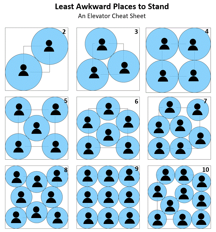
As I discussed this project with some coworkers, one of them pointed out that this seems like a variant of a classic math problem: Circle Packing in a Square. Upon reading into it a bit, it actually seems to be just the kind of solution I had been trying to find.
The problem tries to figure out the biggest size n circles could be and still all fit in a square. One way to think about this is that each circle represents the comfort zone of a person. These seem to minimize the second metric I was showing, minimum pairwise distance.
On one hand, that’s great that there’s a quick reference and it’s possible to verify my results against those from wikipedia. On the other hand, it’s a little like peeking at the answer to a riddle in that it takes away from the thrill of the solving adventure. The great news is that it confirms that the arrangements I was seeing seem to be correct, it’s been pretty neat to work on. An exhaustive set of optimal arrangements can be found at the wikipedia page.. I’ve created a cheat sheet below so that you can print it out and post it in your local elevator as well.
Further Extensions
This approach overall is pretty simplistic. There’s a lot of neat questions you could ask using this framework. For example, what happens if:
- … the elevator is a different shape?
- … one person is stinky and everyone want to keep a greater distance?
- … real people prefer leaning against walls to standing in middle?
- etc. I don’t look into any of these questions but with some work the code could be modified do that.
Another extension happens in the real world. Here I have a simple model for how humans behave in elevators. Is my model accurate? A natural next step would be to try and obtain elevator security camera footage and track actual standing locations. This would be a great way to figure out if the simplifying assumptions at the beginning are fair for the situation.